Tuesday, September 28, 2010

Monkey Diaper Cake

My husband requested a diaper cake for a shower at work for one of his co-workers. I've done so many of these but realized that I'd never posted about them. I found the instructions several years ago here. After the first few I stopped using the exact numbers in the instructions and started eyeballing the amount of diapers needed to get the size I needed.

Don't you love the monkey ribbon! Total score from Michael's!

These cakes are great for showers because they can serve double duty as a centerpiece and as a gift. And the diapers are easily taken apart vs. unrolling them in the rolled diaper version.  I find that the key to making it look good are finding toys that work well as toppers. I'll try and go through my pictures and put together a post of all the ones I've made.

Just a quick post! Have a great day!

Saturday, September 25, 2010

Papertrey September Blog Hop!

Today is PTI's Blog Hop! Check here for details and to post you own link.

So this month's challenge was to post a technique or skill you have learned from a fellow stamper and to even send a shout out to that person(s).  I've learned so much from other people in terms of stretching my comfort zone yet being comfortable with my personal style.

I really couldn't pinpoint a particular skill to show but I did use this card as inspiration (3rd one down).  I loved the simple  design and that it could basically be used for any occasion.  Her bow-tying skills are definitely more advanced than mine!  Thanks Dawn for the "sketch" and for always inspiring!  She's pretty nice too... I've met her twice!


The card is for a wedding I'm attending today.  Sometimes I try to keep in line with the color scheme that's on the invitation.  I know the thought and care that went into picking it so I try and show my appreciation by reflecting their color choice.  This couple's invite was cream with pink accents and grey text.  So I'm not totally in-line because of the orange ribbon... I said sometimes, ok? :)  Anyways... I am loving the "Mr. & Mrs" sentiment from Big & Bold Wishes, it definitely is my go-to for wedding cards.

I guess I could talk about one of my favorite things to do.  I love adding a bit of shine to my images using the Sakura stardust gel pen... so easy too.. LOVE-EET!!


Here's a close-up for you blingy-viewing pleasure!
Have a great weekend! And have fun hoppin'!

Fine Print:
Stamps: PTI Big & Bold Wishes
Paper: SU! Cameo Coral, PTI Vintage Cream
Ink: Pallette Charcoal
Accessories: Mini-Rhinestones, PTI Summer sunrise grossgrain ribbon, EK Scallop punch, Fiskars corner rounder

Tuesday, September 21, 2010

Photography Tuesday: A Day in Chicago


I had a random day off on a Wednesday a few months ago and the hubs and I decided to head downtown.  I suggested going on the Architecture Boat Cruise because we'd never gone.  Then we decided to invite our friends who recently got married.  The bride is a transplant from Atlanta and so it was a great opportunity for her to see and do things in her new city!

We started the morning off at the Bongo Room in the South Loop for breakfast.  It was DECADENT.  We ordered 3 dishes to share among the 4 of us and that was plenty!

Red Velvet Pancakes

White Chocolate Pretzel Pancakes

Architecture Boat Tour: After Breakfast we drove & parked near North Pier Docks.  We went with Chicago Line Cruises because they had the longest tour (about 90 minutes) and the reviews on yelp seemed to be the best.  Our docent was very knowledgeable and fairly entertaining.  My dad was an architect and though we never had gone on a tour, I thought of him often during the cruise.  Our friend, who's an engineer, really enjoyed it too but my hubs & his wife were not quite as excited.   I also personally LOVE any history of Chicago so I was totally in my nerdy element :).  It also helped that it was a GORGEOUS day!  It's very photo intense from this point onward but I promise there is a "sweet treat" at the end!

See the beautiful blue sky?

Thought this reflection was interesting

This is an example of all the condos around the city that were remodeled from older buildings.
You can tell because of the balconies kind of "tacked" onto the exterior

Thought the pop of red was cool!


Dear old Sears... I mean Willis Tower
I love Sears Tower... quintessentially Chicago.  Sigh... Willis Tower.  I haven't gone up yet to see the clear balconies where you can step into "mid-air."  I went to undergrad in the city and from my dorm room I could see these two buildings every night. Very awesome, I miss you tall friends...

The Marina Towers, lovingly known as the Corncobs
 This structure in particular brings the memories flooding back.  My dad was the one who taught me that they were nicknamed the Corncobs.

Looks so stark, yet beautiful
I photoshopped this picture with Maggie Holmes Urban Action.
All in all, I thoroughly enjoyed the tour.  I thought it was educational and I learned a thing or two about the basics of architectural styles in Chicago.  I've heard of walking tours in the city, kind of doing the same thing... I think I'll have to do some convincing... maybe next summer :).

Now our next stop was what my husband was excited about...Morton's Steakhouse.  I'd never been and I love me some steak.  We went for an early dinner so we were able to get the lunch special.  So for the price, I think the food definitely lived up to the hype... enough that I didn't get any good pictures!  This is from my friend Yane.

Delicious looking, isn't it.  This was hub's surf 'n turf.

So, now, here's your reward for reading down all the way to the bottom!  They opened a Sprinkles Cupcake in Chicago!  On the way out of the city we picked up 1/2 a dozen.  Ginger Lemon, Strawberry, Red Velvet & Chocolate.  So GOOD!  Again, I think they lived up to the hype... hubby just doesn't get the whole cupcake craze... oh well.

Yummy!!
It was a really fun, being outside on a rare beautiful August day... with adults, that was a bonus :).  I love my in-laws...

I know there isn't much photography talk in the post, other than photos.  I will say that this was a rare time when I was shooting outdoors - using ISO 200.  I'm usually at ISO 800, aperture wide open taking pictures of the little guy.  So it was fun playing around with the settings.  Let me know if you have any specific questions!!
Have a great day!

Monday, September 20, 2010

Dino-mite!!

Since getting PTI's Tiny Treats: Valentine I have been dying to use the little dinosaur image.  As you well know, I love "punny" sayings and this stamp set is CHOCK full of them.  I really wanted to incorporate the dino image for T's first birthday but ended up going another direction.  This set is not only good for making Valentine's cards but can be used for pretty much any occassion.

So here's my card... well cards... I figured since I had pulled out my supplies, I should make at least 5. :)

I started out by stamping the "label" image that comes with the set with PTI New Leaf ink.  The dotted line is part of the image.  Then stamped the dino image and sentiment with black ink.  Then I took Copics and colored the dino in.  It's such a small image so coloring in 5 of them didn't take too long.  I took care to shade a little bit with a darker green.  I punched the image out with my pink Marvy Mega Circle punch.  I matted the circle with a scallop circle shape in Aqua Mist (Marvy Mega Scallop punch).  I went back I outlined the dino image with a very light blue copic color after I had matted the white circle.  I think it pulled everything together with the blue & green.


For the kraft paper matte layer I stamped Polka Dot Basics II background on the bottom half, again with New Leaf.  Then used scor-tape & glitter to create a border of some sorts.  The main image was adhered with foam dots for some dimension.

To finish things off, I added a little loop of swiss dots aqua mist ribbon next to the sentiment that was stamped then cut out.  For some visual interest, I rounded the corners of one end of the sentiment using my Fiskars 1/4" corner rounder sqeeze punch.  I did the same to all 4 corners of the kraft layer. I used sentiments from my other sets, Shapes by Design & Fillable Frames #1.  Either mini-rhinestones or regular rhinestones were added then "colorized" with a matching copic marker.


I decided to make a few of the cards birthday cards and the rest thank you cards.  I also love adding a little preview of the card on the envelope.  So now they are all ready to go!

Thanks for stopping by and have a great day!

Wednesday, September 1, 2010

Aqua Mist Wedding(s)

Wow! It's September already! I'm kinda ready for the cooler fall weather- it's been a pretty warm summer even by Chicago standards!

Well today's project is a card, actually 2 cards, that I made for 2 weddings. I've been trying to be productive and if I'm going to pull out supplies, I might as well make more than one card. And you guessed it! I used Aqua Mist CS. As inspiration I used this card.


Using PTI's Big & Bold Wishes I stamped the focal image. This stamp set makes it super easy to create a bold, yet elegant statement. Then with Background Basics: Petal Power, I stamped a background onto another piece of Vintage Cream CS. To add a little bit of dimension to the cream cardstock I swiped neatly around the focal image with the darker color of the Tea Dye Duo. On the background piece I distressed the edges and then swiped not so neatly with both colors of the duo. Since both the focal image and background piece are the same color, adding the distressed edging allows the focal image to standout but ties everything together.

Lately, Nichole of Papertrey Ink has been using double loops of ribbon as embellishement and I wanted to give it a try. So I used the swiss dot ribbon to loop behind the focal image which I popped up on dimensionals. To give the whole thing some bling-bling I added clear rhinestones to the corners but if you look closely, I colored them with a matching Copic marker to make them look like aqua mist. This is cool because you don't necessarily have to buy supplies in EVERY color... sometimes you can alter it to match!

The overall effect was a pretty, vintage card, perfect for any wedding.

Have a great day!

Fine Print:
Stamps: PTI Big & Bold Wishes, Background Basics: Petal Power
Ink: PTI Aqua Mist, Dark Chocolate; Tea Dye Duo
Cardstock: PTI Aqua Mist, Vintage Cream
Accessories: PTI Aqua Mist Swiss Dot Satin Ribbon, Clear rhinestones, Copic marker

Wednesday, August 25, 2010

Birthday Hoot

I'm not a huge fan of this card because I made it in a rush but thought I would still post it. The picture isn't that great either 'cuz I took at work in nasty flourescent light. It uses PTI's Wise Owl set combined with Out on a Limb. Both owls are popped up on foam dimensionals. I colored them in with Copics. I was a true Copic newbie... you can see I tried shading but didn't really do a good job... not that I'm any better now :)... a little bit better.

I do love the sentiments... ha ha ha... because they're punny... I love punny. The green mat, I think, is a SU! color. New Leaf wasn't out yet. The leaves on the branches are colored in with a marker, SU! as well. The buttons & ribbon are from my miscellaneous stash.

Just thought you'd enjoy seeing a slightly different, non-baby, non-wedding card :)!
Have a great day!

Monday, August 23, 2010

Sam's baby shower

So remember this wedding card? Well a year or 2 later... it's time for... then comes baby in the baby carriage! Gosh 2 years go so fast!

If you notice a theme with me, I always have blue in stock. I love blue. And for this card it was Aqua mist baby! We were in a little bit of a time crunch so I made it postcard style. I printed the shower details onto ivory pearlescent paper (Paper Source). I stamped the little peapod from Green Thumbs in New Leaf and the inner peas with Spring Moss. Then I added the little baby face from Bitty Baby Blessings. The sentiment was curved a little bit to fit alongside the peapod. If you want to know the fonts I used... let me know, I forgot which ones exactly.

I matted the ivory onto a piece of lemon tart CS. Then for the base, I ran aqua mist through my cuttlebug with an embossing folder and attached both layers onto it. I felt that the embossing was enough to not warrant an more embellishments.

One thing to note is that on shimmery paper like that, the Pallette/original PTI ink dries but just takes awhile. Also when stamping you have to be a little more careful to prevent smudging.

Have a great day!!

Friday, August 20, 2010

Red Flowery First Birthday Card

Hey y'all!

Today's card is one I made to match a really, really cute dress for my friend's daughter's first birthday... yeah... she's 2 now. But remember? I'm catching up! On to the details...


The card utilized a set of 2 peony stamps that I had gotten a long, long time ago based on this post, back when I was researching wedding ideas. The stamp itself is acrylic but it is mounted on a wooden block and it is SUPER CRAZY detailed. I love how it stamps... hmm... makes me wanna take it out and stamp something...

Anyways... I first randomly stamped the smaller peony image onto Pure Poppy CS with SU! white craft inks. I also used my exacto knife to distress the edges of the red layer before I matted it onto a piece of kraft CS. I added some double-stiched Pure Poppy ribbon, embellishing it with a little sentiment tag (from Bitty Baby Blessings & my cuttlebug) and a random button. I matted both layers onto a vintage cream CS base that I had stamped with the larger peony image with Pure Poppy ink.

Instead of centering the matted portion, I offset it to the left so that more of the larger peony image would show. Overall it was a little darker than I had intended but it matched the outfit I had gotten. I don't have a picture but I stamped a kraft colored gift bag using the same large peony stamp using pure poppy ink. That pulled the whole gift package together nicely!

Now that I look at this, I think this would be great for an adult's birthday... maybe it's time to make some more with different colors???

Thanks for lookin'!!

Thursday, August 19, 2010

Lisa Leonard Birthday Giveaway!

Lisa Leonard is giving away a $100 gift card to her store AND $100 Target gift card on behalf of her birthday. I love her designs! I have the tiny square tags necklace and rarely EVER take it off. Her style is so simple & elegant. Stop by her store to see what she has to offer!  And go here for a chance to win!


Wednesday, August 18, 2010

Quickie Wedding Card

And I mean the card was a quickie, NOT the wedding :)

This card came together relatively pain-free, no stamping required. I had bought a stack of really pretty wedding paper I thought I would use for a wedding scrapbook (separate from our wedding album from our photographer)... yeah, that didn't happen. So it turned out it could be great for wedding cards. I adhered a striped ribbon down the middle of the card base. Then tore the patterned paper and glued that on. For the brown satin ribbon - I actually re-purposed ribbon from a gift! I just cut it using pinking shears to get the zig-zag edges. I used really pretty glittery alpha stickers for the bride & groom's intials and ta-da! A pretty wedding card worthy of a pretty wedding. I think the paper & stickers are from K&Company, everything else were miscellaneous supplies I had laying around my office.

Thanks for stoppin' by!!

Tuesday, August 17, 2010

Photography Tuesday: Project 365 fail... sort of

Alrighty!! For my inaugural Photography Tuesday post I will tell you about what was going on at the beginning of this year!

In my post introducing Photography Tuesdays, I told you that there was this "perfect storm" of sorts going on where I started an online class, found out about Project 365, and purchased Photoshop Elements.  As part of the online class, I also purchased a 50mm lens.  This type of lens is a fixed lens, in the sense that it does not zoom in & out.  From what I learned, people like these kinds of fixed lenses for the fact that you can "open them up" or have a wide aperture to let a lot of light in.  And if you need to zoom in & out you move your feet as opposed to the lens.  I am NO expert so I'll leave it to the experts to answer any questions but if you have any feel free to ask me and I can refer you to where I go to find answers :).

Getting the 50mm lens CHANGED my photography.  Well the class helped a lot too :).  It focused on basics and eventually the end goal was to get you to shoot in Manual mode where you, the photographer, choose the ISO (film speed), the aperture (amount of light) & the shutter speed instead of letting the camera do it.  By having full control, you could control the kind of images you capture. 


This scrapbook page is my first week of pictures for Project 365. It is also a good sampling of the first photos I took with my new 50mm.  This was when I had high hopes for taking all the new stuff I learned and taking a picture everyday!  This is also where you read my title and realize that it didn't happen, hahaha!  But I don't think of it as a total fail, at least I tried, right?  And I do have pages for the whole month of January & February.  I even did a special layout to document Tyler's surgery - I can share that at a later time.  So you see how everything came together?

Here are a few more pictures from February. I picked them because I wanted to highlight "bokeh." Here's wiki page that explains it better but here's my attempt. Bokeh is the blurry quality of an image that is not in focus. When you control the aperture, you are controlling the amount of light you will capture but it also affects how much or how little it's in focus. By changing the aperture you can change how much or how little you want the background to be in focus.

The wider the opening the blurrier the backgroud. I love taking pictures this way because your subject is in focus but the laundry that's folded but not put away is not. So to say that in January & February I took tons of pics of Tyler with a blurry background is an understatement. Just to note, the 50mm lens I purchased was a great lens but it didn't autofocus with my D40 and though it was easy enough practicing on inanimate object, it was crazy hard using it with a squiggly child. So, I ended up selling the 50mm and got a 35mm that autofocuses... best of both worlds.

So how's that for my first Photography Tuesday?  What do you think? Interesting?  At least there are cute pictures!
Ok! Thanks for reading and have a great rest of the day!

Photography Tuesdays

So in the past year a so, I discovered Google Reader. It's awesome in the sense that I don't have to go clicking on to each blog link that I'd saved to see if there is anything new - it just shows up in your reader and you read it! You do lose a little bit of the personality of each blog because you don't see the title and decoration that people have up. But it's nice because it's sorta like my daily newspaper except that it reports on people's craftiness or "mom-ness." I'm subscribed to mostly crafty & mommy blogs :).

One thing I've noticed that people do a weekly feature, whether it's a particular manufacturer, project or open forum. So I've decided to focus on photography on Tuesdays. I feel like photography & scrapbooking go hand in hand. If you love scrapbooking, you want to have great pictures to scrap. If you love photography, you want to somehow document the great pictures you take. So I will try and take Tuesdays to focus on what I've done with my photography.

I've always been interested in photography. My dad was an avid hobbyist, I have pictures of me as a toddler playing with tripods and lens brushes :). And I took photography in high school - even learned how to develop my own film and prints! I remember vaguely learning about f-stops and aperture but it never stuck. Most of high school and into college I had a point & shoot that I toted around everywhere. My interest sorta started petering out, when I became busy with pharmacy school and residency. But I always had a few key pictures and/or scrapbooks to commemorate important moments. I used my dad's old digital camera for a few years, especially once I started dating and then during the first year of marriage. I forget the exact impetus for wanting to upgrade but I bought a digital SLR in 2007. It probably was the start of reading people's blogs that made me want to buy one - most likely... actually, I think that's why - I wanted to take nice pictures of my cards and scrapbooks - hahaha!

And when I got my Nikon D40 SLR, like most people, I shot my SLR in Auto mode... sometimes in "P" mode based on what I read on Ken Rockwell's site while researching which SLR to get. I started taking pictures of my cards and immediately posting them onto my then-new blog and on forums... this is all obviously my A.T. (before Tyler) period. I took the D40 on a few vacations and made a few digital scrapbooks (wow... that's a whole 'nother topic, I might need to do Digital Thursdays) and was generally happy with the results.

But to get to where I am currently with this hobby/passion of mine I have to explain a few more things. Like I just mentioned, I was generally happy with how my pictures were turning out. I knew that I was not utilizing the full potential of my camera but I was ok with that. I didn't carry it around with me too much, I ended up getting a new P&S Canon that was easier to carry around. So that became my default camera. The "big one" only came out around holidays or family gatherings/trips.

The biggest turning point - as I'm sure it is for most people - is having a child. When you have a child and if you have even the slightest inclincation towards photography - you WILL take pictures. I was even taking pictures of ultrasound pictures! But the first few months it was easier to use the Canon P&S. That thing basically lived on the coffee table and captured everything... every burp, spit up & smile -we even documented those sleepless nights when he would still be up at 2am. So the first 3-4 months I rarely used the D40. Then around the 4 month mark I started using the D40 to take "portraits" and I think this is also when my Google Reader reading was kicking into high gear.

I started reading Maggie Holmes' blog because other people were talking about her and also about her photography class. I decided that I should take a class and see if I could unlock some more potential out of my camera and I did! The husband even agreed, which was surprising - he's VERY supportive and usually ignores the amount of money & time that goes into my hobbies - but the cost was kinda high, so I was surprised at how easily he said yes. It could have been because I really hadn't done anything for myself in a really long time :). So I took the online class, re-introduced myself to the basics and started taking pictures more often. I also found out about Project 365 around the time of taking the class - it's where you take a picture a day to document your year. (I started but haven't kept up... details in another post :)). I even tried carrying my D40 around everyday but that didn't last long - though I do carry it around more than I did before. It's really true that practice makes perfect.


With the combination of new baby, reading blogs with gorgeous pictures, getting Photoshop Elements, taking an online photo class, and hearing about & starting project 365 - it was the perfect storm for me to start trying to get into photography again, with the key word being "trying." :)


So hopefully you'll join me for Photography Tuesdays and see what I've been shootin'!

Monday, August 16, 2010

Baby Shower of a Greek Nature

Hi All!

What does the title mean? Heh, this card & gift basket set was for my dear, dear friend who is Greek. There's nothing that really made the gift Greek, just wanted to distinguish this baby shower from the other ones! And actually this is a P.T. (post-tyler) Card! I remember making it during a nap & shrink wrapping after he woke up. :)


So here is the card. I used a combination of PTI's Bitty Baby Blessings and their 2008 anniversary set - Everyday Classics. I stamped the star image from Everyday Classics in Versamark Champagne Dazzle - it really does dazzle. Then used aqua mist CS to paper piece the baby stroller. To balance the image, add color and hold the sentiment, I added a star brad from SU! with bits of new leaf DS, random aqua grossgrain & summer sunrise satin (reversed) ribbon. The patterned paper is from SU! and the blue border is punched with the EK Success dotted scallop edger punch. I also added a bit of green to the stroller to finish things off.

For the basket, I got a cute blue gingham covered basket from Michael's and filled it with all the cute stuff from the registry. Covered it with shrink wrap and used a hair dryer to shrinky-dink that thing. Who remembers shrinky dinks?

I made the bow using wired ribbon I had at home and looping and twisting until it was nice and floofy (puffy+fluffy). Taped the card on and I was set to go!

Stay tuned for pictures related to this little one's first birthday party! I was able to help my friend out and photograph his party!

Friday, August 13, 2010

New profile picture

I updated my profile picture to more accurately represent what I look like :P And I updated the header. I've been getting into digi-scrapbooking so this is an early attempt, be nice!

That beautiful blue water in the background is none other than the Chicago River!

Baby Shower of Mine

Ok, don't laugh... but I made my own baby shower invites. Well, alright, let's say that I designed them and used husband- & friend-labor to assemble them. But that happens when you're the go-to-gal for pretty cards among your friends. :) And you know I loved every minute of it!

Here's the front.
The color scheme incorporated Soft Sky (SU!) & Summer Sunrise (PTI)- not too different from the color theme for this party, but I already had a lot of the paper & supplies. I was on a "gotta save" kick, especially with buying all sorts of baby stuff. The bedding that I had gotten for the baby's room was sort of a jungle animals theme so that's what we went with for the shower theme as well. Don't worry, after the invites, I stepped back from any sort of planning :).
For the main image I stamped the giraffe image onto white cardstock and colored it in with Copics. I went on a hunt for the PERFECT match to the blue & yellow at my local Dick Blick's and I totally scored. Then not too long after, Nichole & Debbie from PTI came up with a color chart! Talk about bad timing or... great minds think alike(?). Anyways, the "Join Us" was stamped at the bottom with Simple Alphabet in black. I used a ticket corner punch then matted the giraffe onto Dark Chocolate CS. It's hard to see but on the card base I stamped a border image at the top and bottom using Soft Sky ink. You can click on the image for a larger picture. Before adhering the image, I added a strip of patterned paper.

The wording, for mass production sake, was printed from my laser printer onto a textured linen resume paper - chosen for the fact that I had a lot of it :). That's is also why the "Join Us" on the front was in black ink. I would have liked to have done it in brown but I didn't have a color printer. So black it was. For the fonts, I used Century Gothic, which is the same font as Simple Alphabet - that took some time to figure out but I'm so glad I did! The cursive font is Little Days. Nichole featured it in a project long ago and I think it really matches baby items. I also rounded all the outside corners.

For some reason, I really wanted to make a pop-up card. I must of seen it somewhere. I do have a card book that I bought when we went to Japan but I made it simple so that there would be no cutting. Basically you cut a small strip of paper and score it so that when folded, you have a box. You adhere one end to the top of the card and the other to the bottom. Then on the flat piece you can add what you want to "pop-up." I realize this explanation really doesn't explain anything... I'll try and put up a better one later :). To decorate the pop-up piece, I die cut animals using my Cuttlebug and colored in parts of them with marker. It was easier than paper piecing, especially since the hubby ended up helping out with the coloring and adhering. I used a border punch to get the moon & stars edge, so cute!

Fine Print:
Stamps: SU! Bundle of Joy, PTI Simple Alphabet
Paper: PTI Aqua Mist, Dark Chocolate SS white, Father Knows Best PP, misc. resume paper
Ink: Palette Burnt Umber, Black Noir
Accessories: Copics(B14, B12, Y19, Y32E31), Summer Sunrise Grossgrain, Misc square brad, Cuttlebug Zoo Animals die, SU! ticket corner punch, Fiskars corner rounder punch, EK Succes Moon 'n Stars edger punch

Wednesday, August 11, 2010

Thank You Berry Much

This card was pretty simple to put together. I added paper from my Stampin' Up collection to the bottom of the plain white card base (PTI Stamper's Select White of course!). I first stamped the larger strawberry PTI's Green Thumb, cut it out and placed a foam dimensional on the back. But before adhering the large berry, I started stamping the little berries, using some masking to get a layered look, across the top. That way I could move the larger berry around to see how much I wanted the little ones to peek out. I also purposely stamped off some ink on a few of the berries to get variation in color. I honestly don't remember what colors I used... I think the red is Pure Poppy ink just not at "full strength." It matches the paper, pretty darn well, if I do say so myself! :)

I then added the little curlicue-leafy-things around the berries. For a more finished look, I added the black gingham ribbon (SU!). It kinda adds a little country charm, no? Then finished the whole thing off with a 'punny' sentiment. I love punny sentiments!! If you noticed, I added some sparkle to the large strawberry with my Sakura stardust pen - love that thing!

Alrighty, I'm moving right along in my catching up!
Thanks for stoppin' by!

Monday, August 9, 2010

Christmas Cards 2008

It's a little early to be thinking of Christmas but... oh well...

I don't know if I've ever posted Christmas Cards here. In 2007 I handmade 4 different kinds of pretty elaborate cards. But for 2008, I decided to mass produce a simple design since I was preggo and just getting over being really nauseous.


I started out with a simple white base using PTI Stampers Select White. Then I stamped a frame from SU!'s Frames with a Flourish using Pallete Ink Charcoal. Then using a negative mask- basically a piece of paper with the Frame cut out- I stamped a Stamps by Judith Pine bough over & over until I got the "branch" to look the way I wanted. Then stamped the sentiment from a miscellaneous holiday set I have. I love the modern look of the gray ink on white paper

I stamped a little dot from PTI Beautiful Blooms to make the "ornament." then drew in the "hook" with a black gel pen. The Ornament was then colored over with a Sakura stardust pen for some sparkle, then some liquid crystal over it all to make it shine!

Then on the back of each flat card, I stamped another sentiment:
If the front said "Merry Christmas," the back said, "& Happy holidays" and if the front said "Happy Holidays" the back said, "& Winter wishes" to be a little politically correct for co-workers. The "&" and the greeting with our names were stamped using PTI Simple Alphabet, SUCH a versatile set! The tiny heart is from PTI My Punny Valentine.

Here's a note on mass producting things. I try and do all the stamping of one color all at once. So all the gray stamping was done first, then the green, then the red, then all the other elements added in. This helps to keep your work area somewhat organized since you only have out what you need for that particular step. And if you are making a lot of cards, the repetition helps you zone out a little and it becomes relaxing... at least it does for me :).

Hope you enjoyed this little piece of Christmas in August!
Thanks for comin' by!

Thursday, August 5, 2010

New home Card Set

I have been meaning to post this for a very long time. I made a set of cards to give a co-worker/fellow crafter because she was moving out of state. I used the Boards & Beams set from Papertrey Ink. Sorry that the picture quality isn't so great. I've gotten better at taking pictures but lately they're of my cutie son.

I made a set of 10 flat cards featuring the bigger house from the B&B set. I stamped them on kraft paper in black ink. Then went and colored in the roof, windows, railing & door with copics. I liked the fact that by stamping on kraft paper, I didn't have the urge to color in the whole house, which saved me time because I made 10 of them. I cut out each house using my cutter-bee scissors.

Then for the card bases, I stamped the fence image twice onto a piece of vintage cream CS, knowing that the house would cover the middle. I masked the fence on the left side and stamped the tree image. Did I mention I made 10 of them? I matted the cream CS onto Pure Poppy CS then the whole thing onto a kraft 4.25 x 5.5 base. I added a strip of Aqua Mist paper for a little more color, since everything was so kraft-y. I stamped the sentiment "Our New Home" at the bottom, perfect for sending people your new address. I kept the overall design flat and simple to make mailing them easy and it made it easier to mass produce. 10 of them. :)


Now the piece de resistance for me was the box I made to house, haha house, the cards. I used a template I had found somewhere by prchvs (Renée), I think from SCS or internet searching. It's easy to make, you need 1-12x12 sheet and 1-6x6 piece. I used a piece of green CS I had from my stash and a 6x6 sheet from Everyday Blessings PP. I tied a piece of Pure Poppy double stich ribbon around it and added another house I had colored & cut. The top cover has a little velcro closure to keep everything in. All 10 cards & 10 envelopes fit neatly and made for a great presentation when I gave it to my co-worker. The box is meant to hold 5 or 6 folded cards but since these were flat I was able to fit more in. And the box could be used for storing other things afterwards!

Cool, huh?
Thanks for comin' by and let me know if you have any questions about supplies or tools.

Aaaaand... I'm Back (I think)

Well... I've decided to pick up this blogging thing again. I went to the CHA Super Show last weekend and after meeting fellow bloggers, PTI forum members and of course PTI superstars and Nichole (!) (see picture below), I felt the need to contribute to the blogging world again. :) It also helped being crafty, just to be crafty. I went with 2 of my co-workers/scrappy/crafty friends and we had a blast slowly meandering from booth to booth doing some make-&-takes and checking things out.

From L-R: Debbie Olson, Heather Nichols, Nichole Heady, me, Dawn McVey, Jennifer Ellefson, Michelle Wooderson
Why do I look so nervous and short? Cuz I am.

So you may be asking, "where the heck have you been?" And I would answer, "right here, reading and absorbing everything, just not posting!" Then naturally you would ask, "Why not?" And instead of a smarty-pants answer, I would launch into a long summary of where I've been. But since you are not physically in front of me to hear that long summary, I will give you the bulleted list version. And hopefully I'll start elaborating as I get back to blogging.

August of 2008: Pregnant & VERY nauseous
January 2009: Discovered heart anomaly on ultrasound
April 21, 2009: Baby Tyler is born
April 24, 2009: Tyler's first surgery (crazy, I know)
July 2009: Back to work
January 2010: Tyler's second surgery
February 2010: Tyler's first birthday preparation underway
April 2010: Tyler's first birthday party

Now, of course, you're probably thinking, "oh no! She's gonna post an abnoxious amout of gratuitously cute baby pictures." And because you thought it - I will! Just kidding... I'll just put up a small smattering here & there for fun. There's plenty of time for that, plus- that's what Facebook is for.

A somewhat recent picture from this summer. He looks sheepish to convey my feelings for the lack of posting

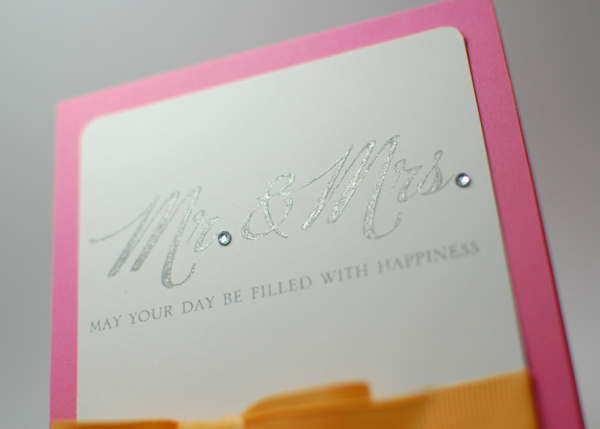
On the crafty side of things, I did craft up until the baby was born, we will call that period: A.T. (ante tyler) - my Latin is very limited and mostly only to medical terminology. But just did not have the energy to post. Then with the disconcerting news we received in January, I started blogging about that experience separately. Ask if ya wanna read about it. I'm sure pieces of it will start to flow into this blog. Then all you mommies know, it is hard to carve out time to sit and do anything. I've been able to do some stuff here & there but only in sort of an "as needed" basis - in a "oh wedding today?" whip something up kind of way.

So I am calling this time in my crafty life: P.T. (post tyler) and hopefully it will provide some reading fun for you all!

I have a lot of catching up to do so come along on the ride with me!